Typography Task 2/Typographic Exploration & Communication
2/5/2023 - 28/5/2023 / Week 6 - Week 8
Janice Marie Eng Chia Hui / 0361521
Typography / Bachelor of Design in Creative Media / Taylors
University
Task 2 Typographic Exploration & Communication

Table of Contents:
Lectures
Instructions
Task 2 / Typographic Exploration & Communication
1. Searching for ideas/inspo
We were given 3 text to choose from for one text that we wished to format.
The one I decided to do was called 'The Role of Bauhaus Thought on Modern
Culture'. Whew what a long title. After I did a bit of read up on Bauhaus, I
went on Google and Pinterest to search from some inspo. Bauhaus seems
to like primary colours and geometric shapes.

Figure 1.1 Inspo 1


2. Layout/Idea Exploration
After gathering info and inspo, I decided to start the text formatting
in InDesign. In the end I decided to go with the sketch that leaned into
the geometric elements that is so used in Bauhaus designs. I tried to
mind the flow of words? I'm not sure if it worked.

Figure 1.4 Sketches (7/5/23)


Figure 1.6 Different layouts (7/5/23)
After getting feedback from Sir, I changed my layout accordingly.


Figure 1.7 Layouts after Feedback (10/5/23)

.png)
3. Final Layout
I
went and re-adjust the letterspacing and tried to arrange the text in a
better way because Sir mentioned how the bottom of my text looked too ragged. So I tried to smoothen it out, at least I hope I did.
Margins: 12.7 mm
Gutter: 5 mm
Head
Font : Univers Lt Std
Body
Font : Univers Lt Std
Type size: 9 pt
Leading : 11 pt
Paragraph spacing : 11pt
Characters per line : 34
Alignment : Left-align

Figure 1.10 The Role of Bauhaus Thought On Modern Culture Final
(PDF)(10/5/23)
.jpg)
Figure 1.11 The Role of Bauhaus Thought On Modern Culture Final
(Grid)(10/5/23)
Figure 1.12 The Role of Bauhaus Thought On Modern Culture Final
(Grid/PDF)(10/5/23)
Feedback
General Feedback : Text must be aligned with something
Specific Feedback : Fix the arrangement of the text, take away graphical
elements, and try to fill up the bottom space with something else
Week 7
General Feedback : Do not use a black background for your layout
Reflection
My experience during this task is better than the last one. The previous
exercise gave me the basic knowledge to do the stuff in this task, so things
went smoother, a bit.
My observation for this task is that trying to make all text fit into a
spread as well as putting in graphical elements into the spread can be quite
challenging. The fonts cannot be too small lest the readability decreases.
This is my 1st time using 3 columns of text so that was a challenge. I had
to get... innovative? to try and fit all the text into the spread along with
all the graphical elements.
My findings for this task is that creating a layout is hard. Research needs
to be done before starting and coming up with something suitable is very
time consuming and makes my brain hurt.
Further Reading

Figure 2.1 Teapot designed by Marianne Brandt
This article talks about the history of Bauhaus and mentions some of the
famous designers of the Bauhaus Movement as well as showcasing some of the
art from that movement.
2. Typographic Design Form and Communication (pg 65- pg84)

Figure 2.2 Typographic Design Form and Communication
This section of the book introduces us to the history and uses/importance
of grids in type. The book says that the grid we know today is rooted from
columnar cuneiform tables impressed by the Mesopotamians. The
development of the modern grid cannot be attributed to a single
individual as is constantly being developed on as time
passes.
Next is structure and space which tells us that space us a common
denominator for typographic communication. The book
recommends we think of type in space with grids. For example to
imagine grid line extending from objects in space. The book also says
that changing the orientation of the letterform within a closed space can
how we perceive it. For example, rotating a letter makes it appear to
tumble. People are also more used to horizontally grounded text compared
to vertically grounded text.
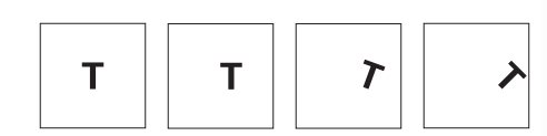
Figure 2.3 Letter T in different orientations

Figure 2.4 The Golden spiral/Fibonacci Sequence
Next on the list we have single(like me hahahahaha) column grids. For
simple text, it is often set as a single block. This is due to budget
constraints, standard paper size and the function of typographic
information. It is important to consider the text block and the
margins of the page. Margins help set the typographic stage and
accommodate elements that support the text. Single-column grids may seem
simple but actually require a lot of attention to detail(leading etc)
from the designer.

Figure 2.5 Example of Single Block grid

Figure 2.6 Multicolumn grid
Modular grids allows for better presentation of complex information.
The more complex the grid structure the more flexible the
organizational possibilities. However too much variety deprives the
design of hierarchical clarity, while too much unity makes the
experience boring for the reader.

Figure 2.7 Modular Grid
Improvisational structures evolve in response to the specific
elements of information as opposed to modular grids. Once the
dominant element is determined, we would be able t arrange them in
the spatial field with correct visual hierarchy.

Figure 2.8 David Colley poster
Comments
Post a Comment